By Patti Parish-Kaminski, Publisher
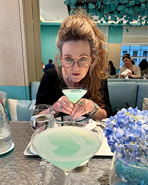
Surrounded by Tiffany Blue – even the drinks! – in the Blue Box Café in NYC.
Now that I am close to catching my breath due to all the comings and goings of the “Birthday Quarter,” which I sincerely doubt I can make it another seven weeks as four weeks have just about done me in, I have been reminiscing about my time in the Big Apple. I have a couple of takeaways – ideas even – from my NYC jaunt worthy of sharing.
First and foremost, everyone, and I mean everyone Lisa Ann and I met, interacted with or even just passed on the street was incredibly friendly. This “rude New Yorkers” moniker is a myth as far as I can tell. No one pushed, shoved, hollered or even gave us the side eye. And we talked to everyone, especially Lisa Ann who told every single person in Manhattan that I was 60. Yes, she’s going to get it back in spades this March. Of course, the incredible amount of complimentary gifts I received because of said declaration took the sting out a bit, as it was primarily cake and champagne. I really like both of those things.
The other major takeaway, confirmed for days on end as I continued to receive packages from the best in NYC, is that I really do need a signature color. For years I’ve claimed red as my signature color, and frankly, that’s just boring. I truly need to step it up.
Signature colors equate to really amazing things. I mean, when you receive that orange box with the navy ribbon, you’re already happy, even before you open it. Same with that swirly, embossed green number. These signature shades exude joy.
Of course, the landmark is Tiffany Blue, and they even call the store in New York “The Landmark.” Tiffany’s has trademarked their particular shade of blue, and it has its own Pantone number. So, I did a little R and D on the signature color topic.
Pantone releases their color of the year every year. This year, it’s called Mocha Mousse, “a warming, brown hue imbued with richness capturing a global mood of connection, comfort and harmony.” It’s brown.
But, I learned you can go on their website to help develop your own signature color. You know I did it. Here’s what came up as my vision: “Bold and red combined with a hint of pink nostalgia immediately bring to mind strong, passionate and whimsical shades.” Whimsical? Quirky, imaginative – I guess I can see that.
According to Pantone, I’m basically a combo of Poppy Red meaning bold, passionate energy and a touch of Aurora Pink for a nostalgic sparkle. The new shade embodies “passion, individuality and playfulness.”
I can buy that, but here’s the rub. Pantone doesn’t offer naming suggestions for the new color creation. That’s all on me, and I’m up for the challenge.
I’m thinking something like Bold Babe or Patti Parkle fits the bill. What do y’all think – got ideas? Let me know. After all, if Tiffany’s can do it, why can’t I? See y’all next week – on the porch!

Patti Parish-Kaminski
Follow Patti Parish-Kaminski on Facebook at www.facebook.com/OnThePorchWithPatti/ and on Instagram at instagram.com/ontheporchwithpatti/.